Tools Used: Adobe InDesign
Here, I'm exploring typography and style in booklet.This was more about studying typography and style to create visual continuity.We were tasked with visiting The Swiss Grid exhibit and selected a poster that we foundstriking. The bold orange and black stuck out to me because it felt like the audience was me specifically. I wanted to capture what that might look like across a booklet spread.
Tools Used: Adobe InDesign, Adobe Photoshop, Adobe Illustrator
Tasked with building a brand, I decided to go with an idea that was personal to me. My fiance and I have always dreamed of owning a cafe where people can sit and enjoy a good cup of coffee.I wanted to create a brand that was warm and inviting, with a focus on community and connection. The colors and typography were chosen to reflect this, with earthy tones and a friendly, approachable font. The logo was designed to be simple yet memorable, with a focus on the name of the cafe and the idea of bringing people together over a cup of coffee.
Tools Used: Adobe InDesign, Adobe Photoshop
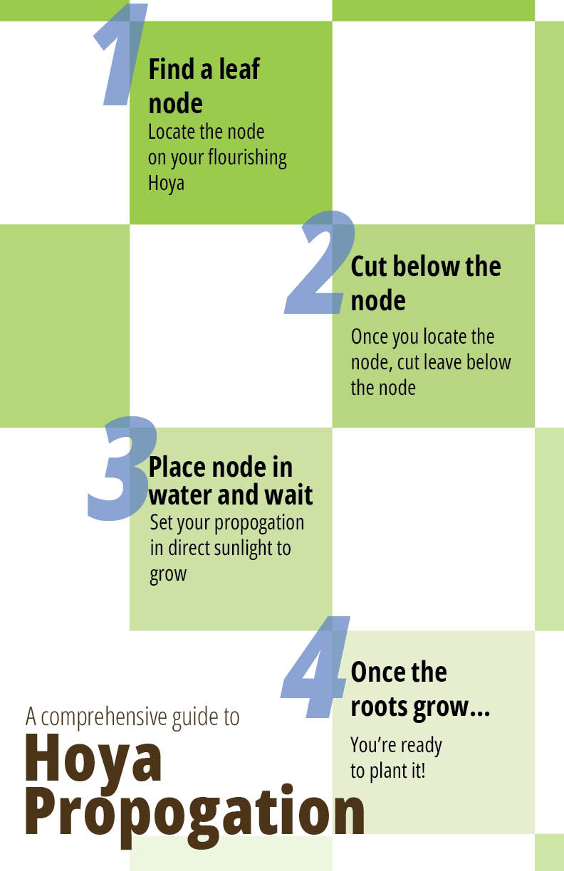
Inspired by the 6 word project, this project was about creating visual communicationthrough typographic systems and hierarchy. I chose something that was personal to me to build off of.I have a Hoya that has grown beyond the pot and I wanted to show someone how they might propagate a plantby themself. I wanted to portray how a Hoya plant grows through layout. Starting with the title 'A comprehensive guide to propagating a Hoya's, I wanted to show that as the root of the Infographic, thesoil. As we work our way up, we flow into various levels of opaqueness with the green boxes whichrepresent the leaves of the Hoya. The numbers give the reader a sense of order and hierarchy to follow.I chose a sans serif font to keep the focus on the content and not the typeface. I wanted to make surethat the reader could focus on the content and not be distracted by the design behind. The colors werechosen to be earthy and natural to represent the plant and the soil.